3 minutes
How education level affect Gini index and unemployment rate in Barcelona (Part. 1)
I like to walk along the streets of Barcelona. Across various districts of the city, I found that those districts not only distinguish themselves from the building styles, but also from other aspects, such as public facilities, road conditions, prices on menus, even outfits of their residents. This phenomenon makes me wonder how this city is look like from a view of data scientist. So I dug some datasets from the open data source run by the city government of Barcelona.
I chose to look into three categories, namely Gini index, education level and unemployment rates, all across 10 most populated districts of the city, in the year of 2019.
 |
|---|
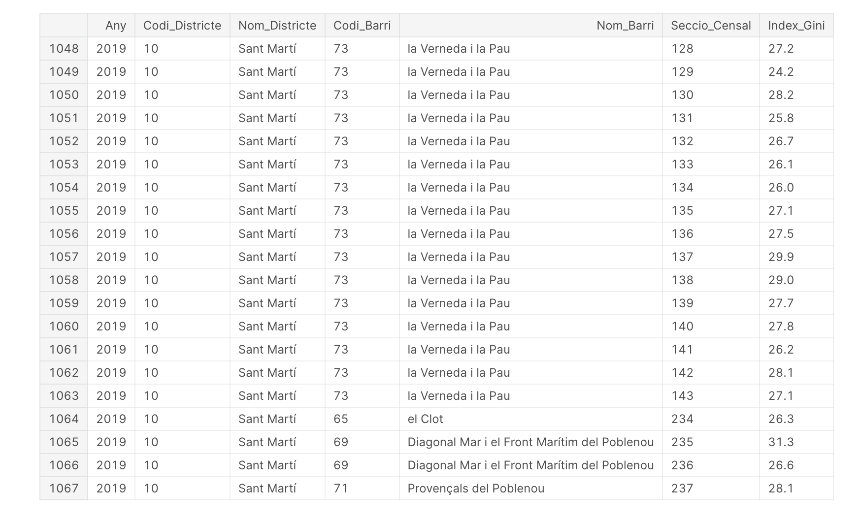
| Tail of Gini_index dataset |
I need to drop useless columns and calculate the mean across all districts.
 |
|---|
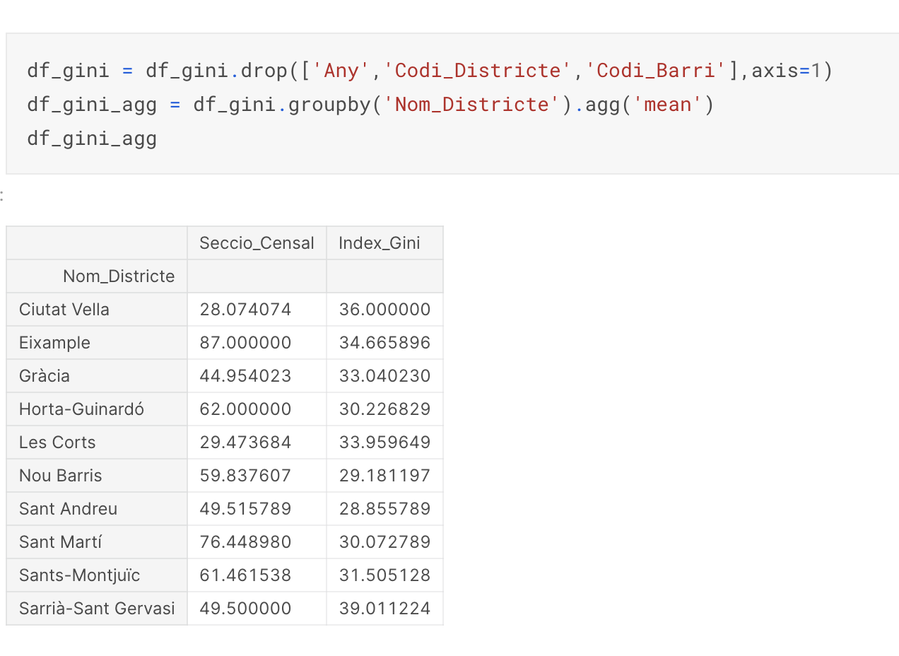
| Get the mean of Gini_index across all districts |
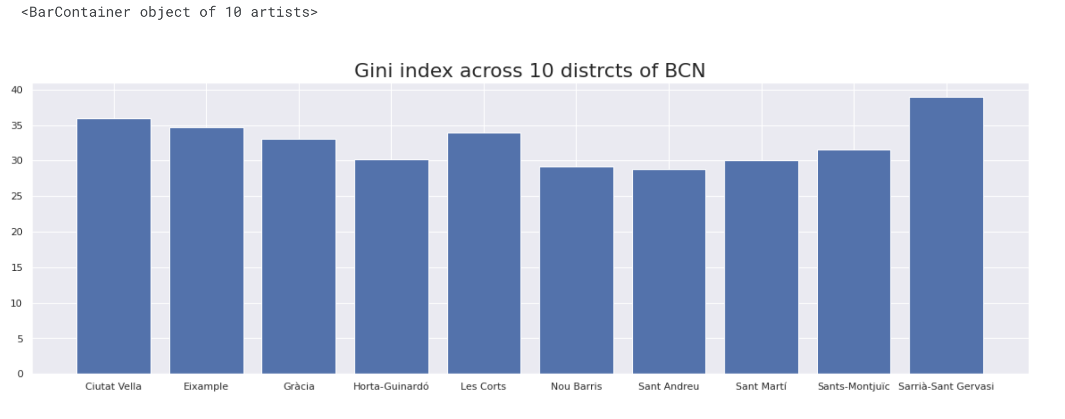
Obviously the Sarrià-Sant Gervasi district has the highest Gini index, and Sant Andreu has the lowest. Let’s plot them to see their difference more clearly.
df_gini_agg = df_gini_agg.reset_index()
sns.set_theme()
plt.figure(figsize=(20,6))
sns.set_style("darkgrid")
plt.title('Gini index across 10 distrcts of BCN', fontsize=22)
plt.bar(df_gini_agg['Nom_Districte'], df_gini_agg['Index_Gini'])
Then I get a graph like this:
 |
|---|
| Bargraph of Gini_index across all districts |
Next I try to find out how the Gini index connects to unemployment rate. At first I need to make sure all 10 districts are included in this data set. Then the data is grouped by two categories, one is month, another is name of district. Let’s examine the unemployment rate by month for each district. The code to plot this graph is as following:
df_rate = df_rate.drop(['Nom_Barri','Any','Codi_Districte'], axis=1)
df_rate_agg_month = df_rate.groupby(['Nom_Districte','Mes']).agg('mean').reset_index()
df_rate_agg_month
plt.figure(figsize=(16,7))
plt.title('Unemployment rate across 10 distrcts of BCN each month in 2019', fontsize=22)
plt.xlabel('Month', fontsize=15)
plt.ylabel('Unemployment rate', fontsize=15)
ax = sns.lineplot(x='Mes', y='Pes_atur', data = df_rate_agg_month, hue='Nom_Districte', linewidth = 4)
sns.move_legend(ax, "upper left", bbox_to_anchor=(1, 1))
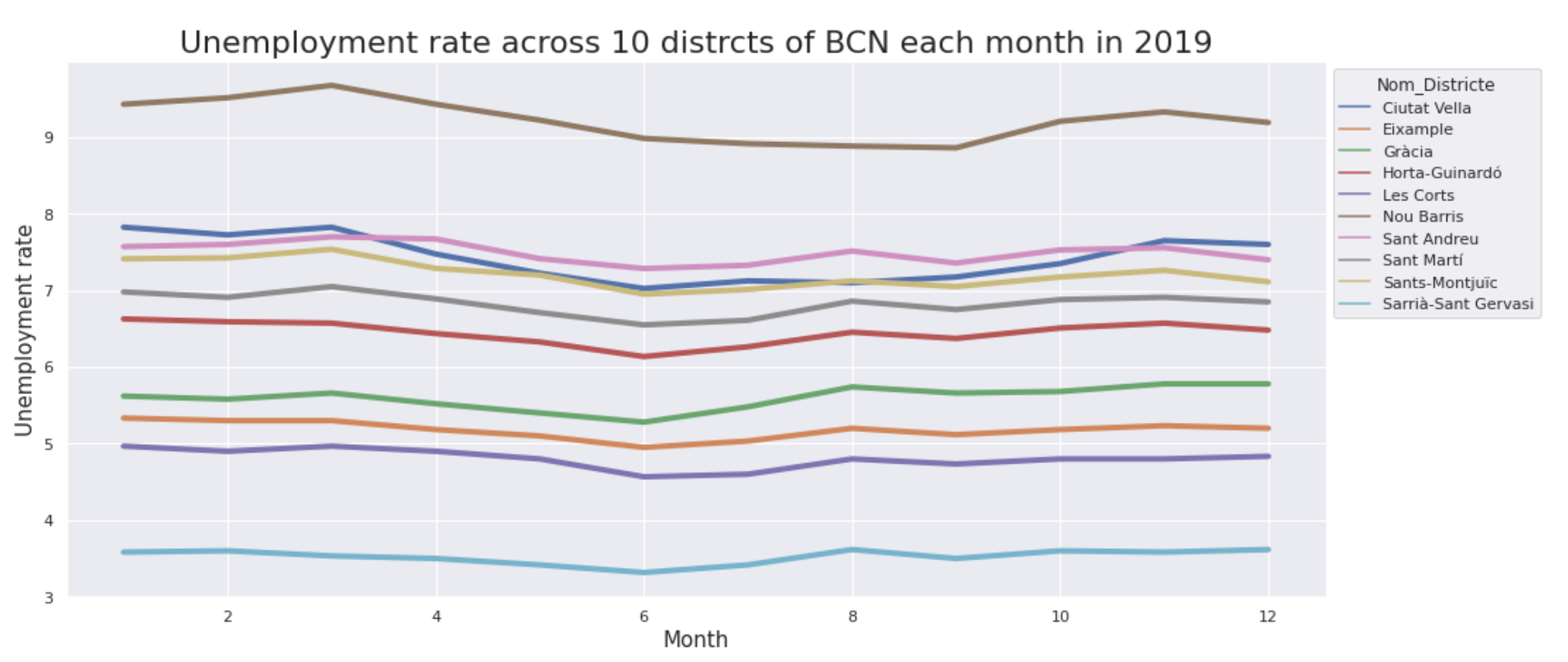
And the result is:
 |
|---|
| Linegraph of Unemployment dataset |
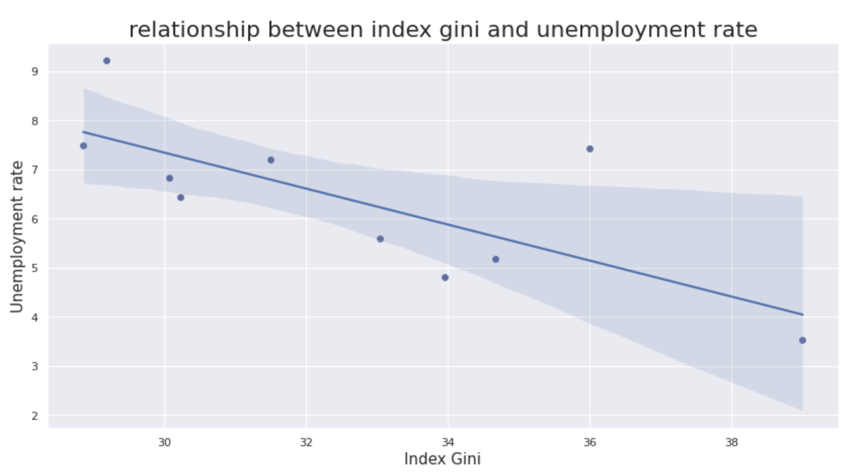
For most districts, unemployment rate decrease to lowest in June and July, which suggests that more people are hired during this period, possibly because of the tourism season. Another thing worth notice is the district with lowest unemployment rate is Sarrià-Sant Gervasi, which also possess the highest Gini index. It seems there is some correlation between these two, so let’s delve in.
df_rate_agg_mean = df_rate.groupby('Nom_Districte').agg('mean').reset_index()
result = pd.merge(df_gini_agg, df_rate_agg_mean, on='Nom_Districte')
result = result.drop(['Codi_Barri','Poblacio_16_64_anys','Seccio_Censal'],axis=1)
plt.figure(figsize=(14,7))
plt.title('relationship between index gini and unemployment rate', fontsize=22)
sns.scatterplot(data=result, x='Index_Gini', y='Pes_atur',color='r')
sns.regplot(x='Index_Gini', y='Pes_atur', data=result)
plt.xlabel('Index Gini', fontsize=15)
plt.ylabel('Unemployment rate', fontsize=15)
Above codes bring me this graph:
 |
|---|
| Correlation between Gini_index and Unemployment rate |
Seems there is a negative correlation between these two factors. This discovery is actually the opposite of what i thought. Maybe high Gini index means more rich people, thus they provide more employment opportunities for jobseekers. Now I need to turn to the aspect of education, to find out if it also plays a role in affecting the unemployment rate.(To be continued)