3 minutes
How education level affect Gini index and unemployment rate in Barcelona (Part. 2)
The dataset 2019_academic.csv covers a survey of all residents’ educational level (from “no education” to “university”) in all ten districts of Barcelona city. Data source is from the open data source run by the city government of Barcelona.
After cleaning and organizing the raw data and apply Seaborn for the plotting:
df_edu = df_edu.drop(['Any','Codi_Districte','Codi_Barri','Nom_Barri'], axis=1)
df_edu = df_edu[df_edu['Nivell_academic']!='No consta']
df_edu_agg = df_edu.groupby(['Nom_Districte','Nivell_academic']).agg('sum').reset_index()
plt.figure(figsize=(18,7))
plt.title('academic level of 10 districts BCN', fontsize=22)
plt.xlabel('Districts', fontsize=15)
plt.ylabel('number of people', fontsize=15)
ax=sns.scatterplot(data=df_edu_agg, x='Nom_Districte', y='Nombre',hue='Nivell_academic', style='Nivell_academic', s=100)
sns.move_legend(ax, "upper left", bbox_to_anchor=(1, 1))
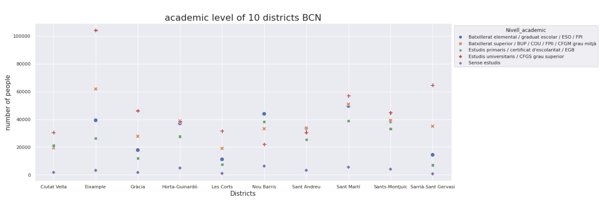
I get this scatterplot:
 |
|---|
| Scatterplot of residents’ educational level |
Well, this graph doesn’t provide enough information for me to see the trend. One option is to narrow the education level to two categories: above or equal high school level and below high school level.
df_edu_agg['Nivell_academic'] = df_edu_agg['Nivell_academic'].replace(['Estudis universitaris / CFGS grau superior'], 'university or higher')
df_edu_agg['Nivell_academic'] = df_edu_agg['Nivell_academic'].replace(['Batxillerat superior / BUP / COU / FPII / CFGM grau mitjà'], 'high school')
df_edu_agg['Nivell_academic'] = df_edu_agg['Nivell_academic'].replace(["Estudis primaris / certificat d'escolaritat / EGB"], 'elementary school')
df_edu_agg['Nivell_academic'] = df_edu_agg['Nivell_academic'].replace(["Batxillerat elemental / graduat escolar / ESO / FPI"], 'middle school')
df_edu_agg = df_edu_agg.pivot(index = 'Nom_Districte', columns = 'Nivell_academic')
df_edu_agg['above_highschool']= df_edu_agg['Nombre']['university or higher'] + df_edu_agg['Nombre']['high school']
df_edu_agg['below_highschool']= df_edu_agg['Nombre']['Sense estudis'] + df_edu_agg['Nombre']['elementary school'] + df_edu_agg['Nombre']['middle school']
df_edu_agg = df_edu_agg[['above_highschool','below_highschool']].reset_index()
df_edu_agg = pd.melt(df_edu_agg, id_vars="Nom_Districte", var_name="Nivell_academic", value_name="Nombre")
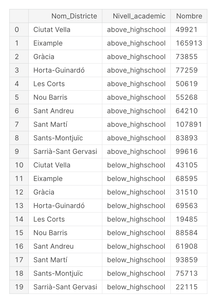
Now the head of most updated dataset looks like this:
 |
|---|
| Organized education data |
Now plot the bar graph that shows academic level in 10 districts with following code:
plt.figure(figsize=(18,7))
plt.title('academic level of 10 districts BCN, version 2', fontsize=22)
ax=sns.barplot(data=df_edu_agg, x='Nom_Districte', y='Nombre',hue = 'Nivell_academic')
plt.xlabel('Districts', fontsize=15)
plt.ylabel('number of people', fontsize=15)
sns.move_legend(ax, "upper left", bbox_to_anchor=(1, 1))
 |
|---|
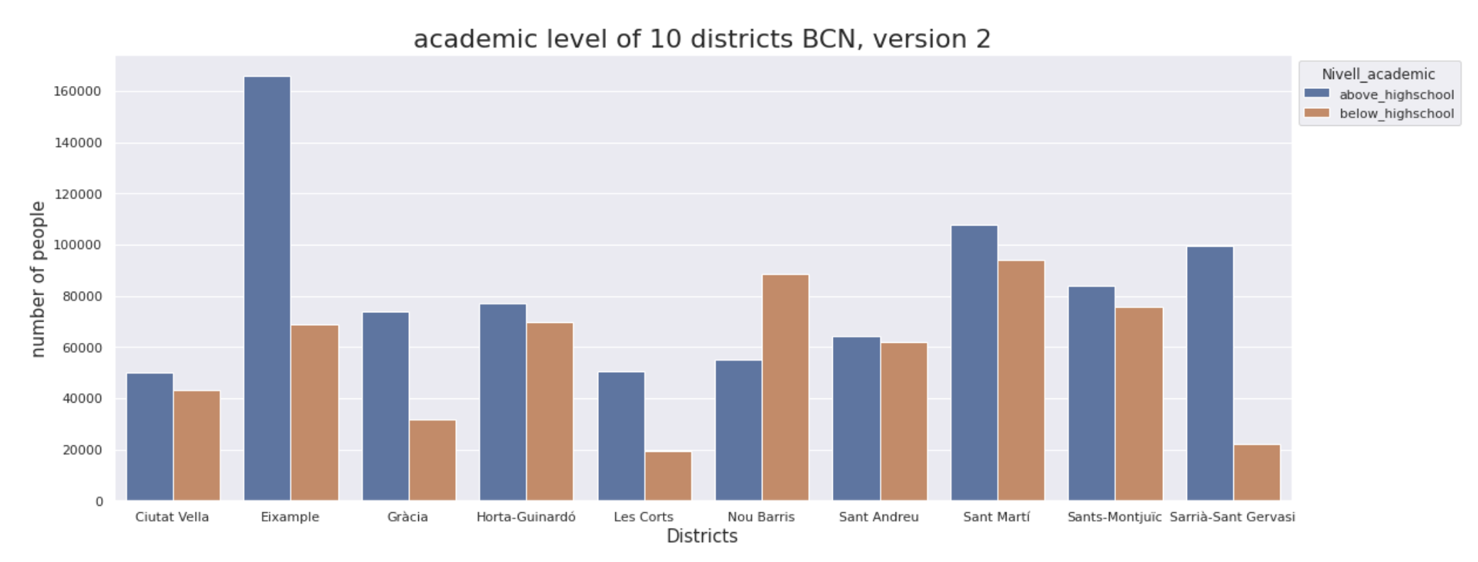
| Bar graph of education data |
Graph above give me some hints:
1.The district of Nou Barris is the only district that high education population is less than low education population. It also has the highest unemployment rate.
2.Among other districts, the district of Sarrià-Sant Gervasi has the biggest difference between high-education group and low-education group. It also has the highest Gini index and lowest unemployment rate. This is an interesting finding.
3.The district Eixample has the biggest population that received high education.
Before I move to check correlation between education level and Gini index and correlation between education level and unemployment rate, I think it might be helpful to engineer the data a bit: to use the difference between population of high education group and of low education group.
final_result1['diff_edu'] = final_result1['Nombre_x'] - final_result1['Nombre_y']
fig,(ax1,ax2) = plt.subplots(1,2, sharey=True,figsize=(11,5))
sns.regplot(data=final_result1,x='Index_Gini',y='diff_edu',ax=ax1)
sns.regplot(data=final_result1,x='Pes_atur', y='diff_edu',ax=ax2)
ax1.set_ylabel('number difference')
ax2.set_ylabel('number difference')
ax2.set_xlabel('unemployment rate')
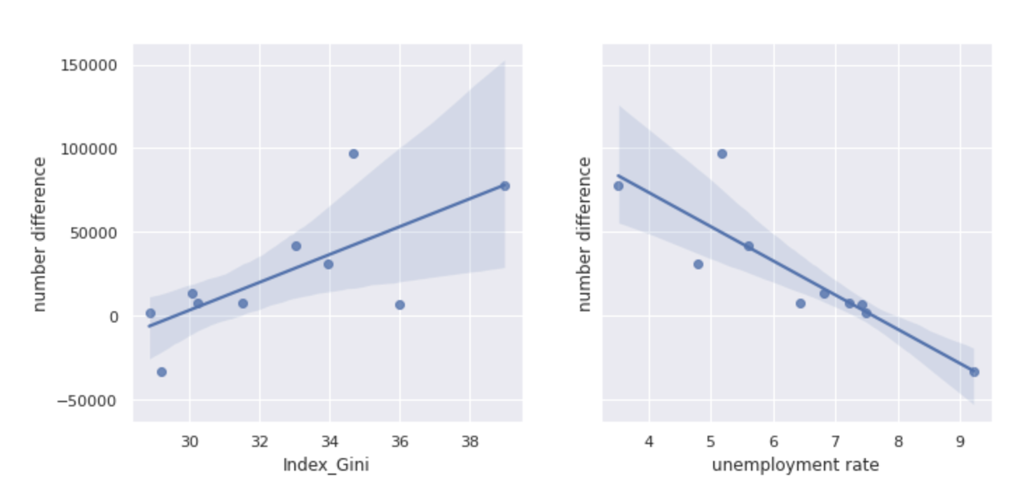
The correlation graphs are as following:
 |
|---|
| Correlation graph of education, Gini index and unemployment rate |
Now the trend is much more clear. I can conclude that in Barcelona across all 10 districts, the bigger the population difference between group with high educational level and with low educational level, the higher the Gini index, and the lower the unemployment rate.